NOTE: The .xlsx file is available for download.
NOTE: Directly below this note is the data dictionary that was prepared and provided by Mikhail1681 (2024).
Table 1
Provided Data Dictionary (Mikhail1681, 2024)
| Variable | Description |
| Store | Store number |
| Date | Sales week start date |
| Weekly_Sales | Sales |
| Holiday_Flag | Mark on the presence or absence of a holiday |
| Temperature | Air temperature in the region |
| Fuel_Price | Fuel cost in the region |
| CPI | Consumer price index |
| Unemployment | Unemployment rate |
Introduction and Business Understanding: According to the Kaggle user who shared this dataset (Mikhail1681, 2024), this sales data can be used to determine “…what factors influence its [Walmart’s] revenue.” The software that will be used to conduct this study are Microsoft Excel and Microsoft Access.
Data Understanding: The raw dataset contained 8 variables (see Table 1 above) and 6,435 records. There were 45 stores in total. The data collection began on February 5, 2010, leaving the first 4 weeks unaccounted for during 2010. All 52 weeks in 2011 were accounted for. The data collection ended on October 26, 2012, leaving 9 weeks unaccounted for during 2012. In total, only 143 weeks out of 156 weeks were accounted for across the 3 years for each store. The maximum weekly sales of all stores was $3,818,686.45 and the minimum was $209,986.25; the data dictionary provided did not provide a unit of currency, so the assumed unit of currency will be the US dollar. Of the 6,435 records, 450 records were flagged for the “Holiday_Flag” variable, and the US holidays in the proximity of the dates of these records were Valentine’s Day (February), Labor Day (September), Thanksgiving/Black Friday (November), and Christmas/New Year’s Eve (December). Notably, the Thanksgiving/Black Friday and Christmas/New Year’s Eve holidays were missing from the collected data for 2012, resulting in 4 holidays per year in 2010 and 2011 but only 2 holidays in 2012 for a total of 10 holidays per store across the years. The coldest air temperature was -2.06°F and the warmest was 100.14°F; the temperature was reasoned to be in °F due to the unreasonableness of °C (100.14°C = 212.25°F, which surpasses the boiling point of water by 0.25°F). Like the weekly sales, the unit of currency for the fuel price was not provided, so the currency will be assumed to be in US dollars; the maximum fuel price was approximately $4.47 and the minimum was approximately $2.47. The maximum consumer price index (CPI) was approximately 227.23% and the minimum was approximately 126.06%; the CPI is a measure of the cost of a fixed basket of consumer goods in one year relative to the cost of that same basket in a base year, but the CPI ignores the consumer’s opportunity to substitute some good with another (name brand versus generic brand) which generally overstates inflation by approximately 1.1% (Mankiw, 2016). The maximum unemployment rate was approximately 14.31% and the minimum was approximately 3.88%.
Data Preparation: When opening the .csv file in Excel automatically, it was found that the “Date” variable was formatted as D/M/YYYY rather than M/D/YYYY and that Excel failed to acknowledge this. In the United States, it is customary to write dates as M/D/YYYY. All records with a date that began with a 13 or higher did not have the same format as the records with a date that began with a 1 through 12. To correct for this, the .csv file was manually opened through Excel so that the data type and format of the “Date” column could be appropriately applied by using the dialogue box for the comma-delimited data file prior to converting the data from .csv to .xlsx. The data type for the “Date” column was changed to “Date” and the format was changed to “D/M/YYYY” and then the file was converted to .xlsx and opened.
Next, a new column “Record_Key” for a unique ID/primary key was created and a unique ID/primary key was created for each record by assigning 1 through 6,435 for the 1st through 6,435th records. This was done before the data was imported to Microsoft Access for further data preparation and manipulation because the output of the Access SQL query will result in a reordered dataset with additional, feature-engineered variables. Although technically this step was not needed because the Access database created was unstructured and non-relational, it was done in case the need for creating a relational database arose during the course of the analysis. The .xlsx file was then imported into Microsoft Access for further data preparation and manipulation with the SQL Design feature.
Microsoft Access: After the data was imported into Access, the top 5 performing stores by total sales were found by querying the database using the Access SQL query in Figure 1.
Figure 1
Access SQL Code for Top 5 Stores by Total Sales with Average Fuel Price, Temperature, CPI, and Unemployment Rate
SELECT TOP 5 Store, ROUND(SUM(Weekly_Sales),2) AS [Total Sales], ROUND(AVG(Fuel_Price),2) AS [Avg Fuel Price], ROUND(AVG(Temperature),2) AS [Avg Temperature], ROUND(Avg(CPI),2) AS [Avg CPI], ROUND(AVG(Unemployment),2) AS [Avg Unemployment Rate]
FROM WalmartSales
GROUP BY Store
ORDER BY 2 DESC;
The output of this query is shown in Table 2.
Table 2
Top 5 Stores by Total Sales with Average Fuel Price, Temperature, CPI, and Unemployment Rate
| Store | Total Sales | Avg Fuel Price | Avg Temperature | Avg CPI | Avg Unemployment Rate |
| 20 | 301397792.46 | 3.42 | 55.45 | 209.04 | 7.37 |
| 4 | 299543953.38 | 3.22 | 62.25 | 128.68 | 5.96 |
| 14 | 288999911.34 | 3.42 | 57.79 | 186.29 | 8.65 |
| 13 | 286517703.80 | 3.29 | 53.7 | 128.68 | 7 |
| 2 | 275382440.98 | 3.22 | 68.22 | 215.65 | 7.62 |
Next, a new query titled “ChronologicalWeeklySalesByStore” was created with the SQL query in Figure 2.
Figure 2
ChronologicalWeeklySalesByStore Access SQL Query
SELECT Record_Key, Store, MONTH(Calendar) AS [Month], DAY(Calendar) AS [Day], YEAR(Calendar) AS [Year],
SWITCH(
Month BETWEEN 3 AND 5, “Spring”,
Month BETWEEN 6 AND 8, “Summer”,
Month BETWEEEN 9 and 11, “Fall”,
Month Between 12 AND 1, “Winter”
) AS Season,
SWITCH(
Month BETWEEN 1 AND 3, “Q1”,
Month BETWEEN 4 AND 6, “Q2”,
Month BETWEEN 7 AND 9, “Q3”,
Month BETWEEN 10 AND 12, “Q4”
) AS Quarter,
Weekly_Sales AS [Weekly Sales], Holiday_Flag AS [Holiday Flag], Temperature, Fuel_Price AS [Fuel Price], CPI, Unemployment
FROM Walmart Sales
ORDER BY 2, 5, 3, 4;
This query returned the chronological weekly sales data by store with the original variables and the new feature-engineered variables “Season” and “Quarter”. It is from this query that all analyses were performed.
Analyses: The query was exported to a new Excel workbook for further analysis and for use in other software.
Excel Analysis of ChronologicalWeeklySalesByStore: Python for Excel code was written, using the Python Editor, to create a few static visualizations to better understand the behavior of the data (Figures 3 and 4). Figure 3 shows the code and output for the histogram of the “Temperature” data.
Figure 3
Histogram of Temperature
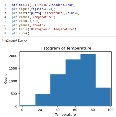
Figure 4 shows the code and output for the histogram of the “CPI” data.
Figure 4
Histogram of CPI
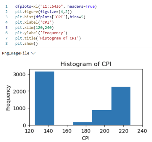
Figure 5 shows a histogram of the “Weekly Sales” data; this figure was created using the histogram chart feature in Excel.
Figure 5
Histogram of Weekly Sales
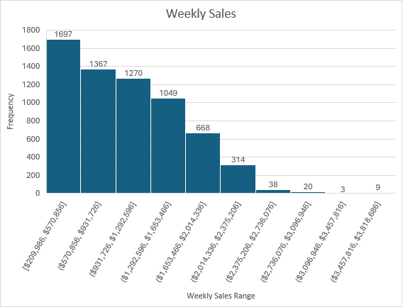
Return to Microsoft Access Based on the histogram of “Weekly Sales,” a SQL query in the Access database was run to determine on which date a store had “Weekly Sales” greater than or equal to $3m USD (Figure 6).
Figure 6
SQL Query and Output for on which date a store had “Weekly Sales” ≥ to $3m USD
SELECT Store, Month, Year, [Weekly Sales]
FROM ChronologicalSales
WHERE [Weekly Sales] >= 3000000
ORDER BY 3, 1;
| Weekly Sales ≥ 3m USD | |||
| Store | Month | Year | Weekly Sales |
| 2 | 12 | 2010 | 3436007.68 |
| 4 | 12 | 2010 | 3526713.39 |
| 10 | 12 | 2010 | 3749057.69 |
| 13 | 12 | 2010 | 3595903.2 |
| 14 | 12 | 2010 | 3818686.45 |
| 20 | 12 | 2010 | 3766687.43 |
| 27 | 12 | 2010 | 3078162.08 |
| 2 | 12 | 2011 | 3224369.8 |
| 4 | 12 | 2011 | 3676388.98 |
| 4 | 11 | 2011 | 3004702.33 |
| 10 | 12 | 2011 | 3487986.89 |
| 13 | 12 | 2011 | 3556766.03 |
| 14 | 12 | 2011 | 3369068.99 |
| 20 | 12 | 2011 | 3555371.03 |
Aside from Store 4 in November 2011, all weekly sales greater than or equal to $3m USD occurred in December (note that no data exists for December 2012).
Then, the maximum weekly sales by month across any year were retrieved from the database (Figure 7).
Figure 7
SQL Query.
SELECT Month, MAX([Weekly Sales]) AS [Max Weekly Sales]
FROM ChronologicalSales
GROUP BY Month
ORDER BY 2 DESC;
| Max Weekly Sales by Month | |
| Month | Max Weekly Sales |
| 12 | 3818686.45 |
| 11 | 3004702.33 |
| 2 | 2623469.95 |
| 4 | 2565259.92 |
| 5 | 2370116.52 |
| 6 | 2363601.47 |
| 7 | 2358055.3 |
| 8 | 2283540.3 |
| 10 | 2246411.89 |
| 3 | 2237544.75 |
| 9 | 2202742.9 |
| 1 | 2047766.07 |
The top 4 months with the maximum weekly sales in any year were December, November, February, and July which correspond to Christmas, Thanksgiving/Black Friday/Cyber Monday, Valentine’s Day, and Fourth of July, respectively. It should also be noted that the bottom 4 months with the minimum weekly sales in any year were October, March, September, and January which correspond to October, the month before Thanksgiving/Black Friday/Cyber Monday and two months before Christmas; March, the month after Valentine’s Day; September, two months after Fourth of July and before Thanksgiving/Black Friday/Cyber Monday; and January, the month after Christmas.
Return to Microsoft Excel
Then, a multiple linear regression (MLR) model was run using the Data Analysis add-in. The “Weekly_Sales” column was selected as the Y variable, and the “Temperature,” “Fuel Price,” “CPI,” and “Unemployment” columns were selected as the X variables (see Figure 8).
Figure 8
MLR Model
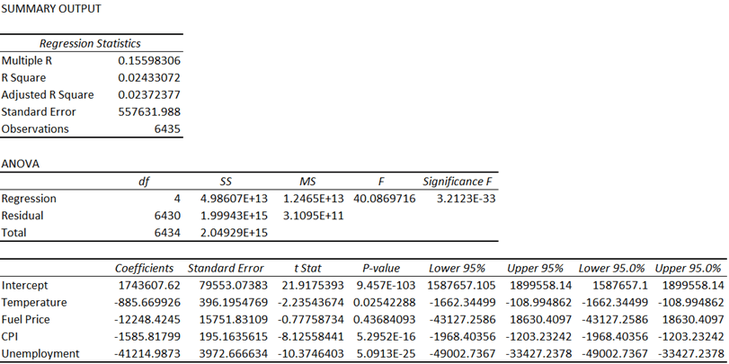
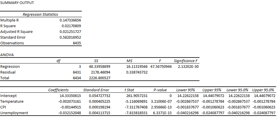
Using a p-value of 0.05 as a cutoff, it was determined that the “Fuel Price” variable must be removed from the model. The model was generated again but without the “Fuel Price” variable (see Figure 9).
Figure 9
MLR Model without “Fuel Price”

After removing the “Fuel Price” variable, all the remaining p-values were below the p-value cutoff, with “CPI” and “Temperature” being significantly lower. Even though this was the case, the R-squared for the model prior to removing “Fuel Price” was 0.02433072 and was 0.02423897 after removing it, and the adjusted R-squared value for the model prior to removing “Fuel Price” was 0.02372377 and was 0.023783787 after removing it (see Figure 10).
Figure 10
Comparison of the R-squared and Adjusted R-squared Values Relative to the “Fuel Price” Independent Variable
| “Fuel Price” Included | “Fuel Price” Excluded | Delta (Included – Excluded) | |
| R-squared | 0.02433072 | 0.02423897 | 0.0009175 |
| Adjusted R-squared | 0.02372377 | 0.023783787 | -0.000060017 |
The R-squared regression statistic is a measure of the proportion of the variance in the dependent variable, which was “Weekly_Sales,” that is explained by the independent variables, which were “Temperature”; “Fuel Price,” prior to being excluded; “CPI,” and “Unemployment,” and ranges from a value of 0 to 1. When another independent variable is added to the model, the R-squared value will either increase or remain the same because more variance in the dependent variable can be explained with more independent variables unless the inclusion of a new independent variable causes perfect collinearity with another independent variable, which would cause the R-squared value to remain the same because the proportion of the variance would be unaffected due to the new independent variable and one of the other independent variables having an exact linear relationship to one another, effectively canceling one of them out. The new independent variable, in this case, would not improve the model’s ability to fit the data. In the case of this analysis, the delta of the R-squared was positive, which indicated that the inclusion of “Fuel Price” allowed the model to better measure the proportion, which means that “Fuel Price” was not perfectly collinear with any of the other independent variables. With “Fuel Price” being rejected due to a high p-value, the new R-squared indicated that the ability of the model to accurately fit the data only decreased by 0.0009175. Whether “Fuel Price” were included or excluded, the R-squared value could be approximated to 2.4%, rounding down, which is very poor.
The adjusted R-squared regression statistic is similar to the R-squared but differs by penalizing the inclusion of more independent variables by adjusting the fitting power by accounting for the number of independent variables in the model. Because it is possible that the inclusion of a new independent variable could negatively impact the fitting power of the model, the adjusted R-squared considers the weight that each independent variable has on the model and can decrease if the inclusion of an independent variable decreases the model’s fit. The delta of the adjusted R-squared was negative, which indicated that the exclusion of “Fuel Price” improved the fit of the model. Regardless, like the R-squared, whether “Fuel Price” were included or excluded, the adjusted R-squared value could be approximated to 2.4%, rounding up, which is very poor.
Although the adjusted R-squared was very low, indicating that the model had very weak explanatory power, the p-values of the independent variables were also low, indicating that that there was a significant relationship between the dependent variable and the independent variables.
Because of the low explanatory power of the model, the model was checked for non-linearity. A standardized residual plot was then generated. First, the standardized residual for each observation was needed (see Figure 11). Then, those values were plotted against the predicted values on a scatter plot (see Figure 12).
Figure 11
Calculation for the Standardized Residuals (StdzRes) and Calculated Values for the First Five Observations

Figure 12
Standardized Residual Plot
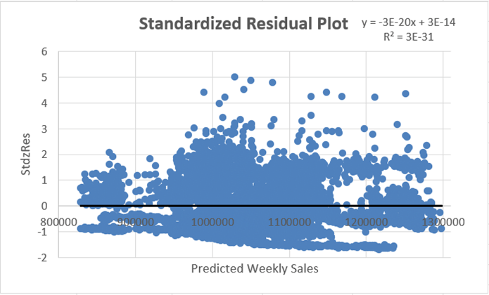
The standardized residual plot did not reveal any apparent pattern whatsoever. This was good because the values were randomly scattered around zero, indicating that the model fit the data well; however, the R-squared and adjusted R-squared were still a concern. Because of this, it was determined that a non-linear multiple regression analysis should be done to determine whether some non-linear relationship was present and whether the coefficients from the MLR model could be optimized by minimizing the sum of squared errors (SSE) to find the best fit for the model. To do this, the Excel Solver add-in was used. The following steps and figures explain this process:
1. The values of each observation were brought to a new worksheet and were pasted into columns A through D.
2. The coefficients of each variable from the multiple regression model were brought to the new worksheet and were pasted into H1:K2, where c0 was the coefficient of the intercept (dependent variable), c1 was the coefficient of “Temperature,” c2 was the coefficient of “CPI,” and c3 was the coefficient of “Unemployment.”
3. The predicted weekly sales (the “Reg.Eq.” column) were calculated by writing the formula for the MLR model.
4. The squared error of each observation was calculated by squaring the difference of the actual value of the dependent variable “Weekly Sales” in column A and the predicted value of weekly sales in Column E.
5. The sum of squared errors (SSE) was calculated by summing the squared errors in the “Squared Errors” column; the SSE was 1.99962E+15, or 1,999,618,597,056,370.
6. The Excel Solver was then set up to minimize the SSE (the objective function) by using the generalized reduced gradient (GRG) nonlinear solving method. Figure 13 shows Step 6.
7. Solver was then run and found the optimal solution. Figure 14 shows Step 7.
Figure 13
Solver Parameters
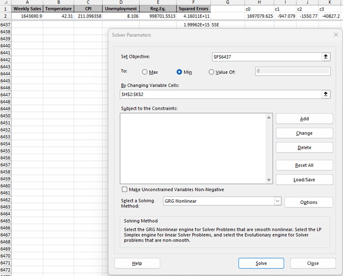

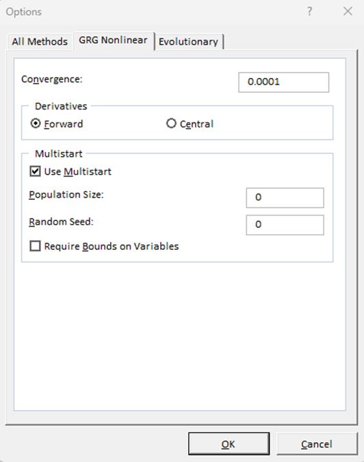
Figure 14
Solver Results. Note the Optimized Minimum Values of the SSE and c0 through c3 as well as the R-squared Value.
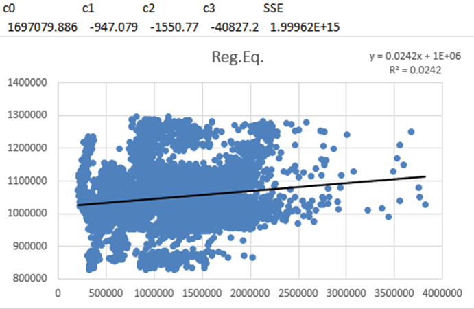
The optimized values as well as the R-squared were effectively negligibly different from the values of the MLR model in Figure 8. Thus, no non-linear relationship could be identified. To further test the model, a logarithmic transformation of the dependent variable was performed and then the MLR model was rerun (see Figure 15).
Figure 15
MLR with Logarithmic Transformation of the Dependent Variable
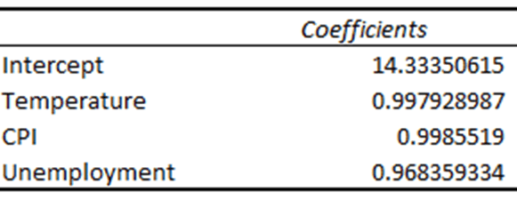
When the dependent variable of a regression model is logarithmically transformed, the coefficients of the independent variables must either be interpreted differently or exponentiated to compute the multiplicative factor for a one-unit increase of the independent variable. In the MLR model in Figure 8, the coefficients of the independent variables indicated by much the dependent variable would either increase or decrease as the value of the independent variable increased by 1. With a logarithmically transformed dependent variable, the coefficients of the independent variables no longer indicate such an increase or decrease. By exponentiating the coefficients, the coefficient can then indicate by how much of a factor that a one-unit increase or decrease of the independent variable affects the dependent variable in terms of percentage. For example, exponentiating the coefficient for “Temperature” results in a new coefficient of 0.997928987, which means that a one-unit increase in the degree of the temperature decreases the value of the dependent variable by 0.002071013 (1 – 0.997928987 = 0.002071013, or 100% – 99.7928987% = 0.2071013%). With that being said, the coefficients of the independent variables were exponentiated and replaced the old coefficients, returning the new MLR model in Figure 16.
Figure 16
Exponentiated Independent Variables
The R-squared and adjusted R-squared were worse for the logarithmically transformed MLR model but the p-values were all lower than the cutoff, with the p-value for “Temperature” decreasing significantly. It was determined that no further testing was warranted.
Conclusion: It was concluded that neither version of the MLR model should be relied upon to accurately predict the value of the dependent variable because neither model measures the variance of the dependent variable well; however, the three independent variables do significantly affect the value of the dependent variable, indicating that identifying and including some number of external factors would likely contribute to the model’s ability to measure the variance of the weekly sales price. Such a factor could be holidays such as Valentine’s Day, Fourth of July, Thanksgiving/Black Friday/Cyber Monday, and Christmas, as indicated in Figure 7. While the MLR should not be relied upon to accurately predict the value of Weekly Sales, it appears that depending on the months with the identified holidays to result in the maximum weekly sales and the months either directly or relatively preceding or succeeding those holidays to result in the minimum weekly sales is reasonable, which could indicate that an underlying sociocultural effect of holiday spending might have overwhelmingly influenced Walmart’s weekly sales during the period from Q1 2010 through Q3 of 2012.
References:
Mankiw, N. G. (2016). Macroeconomics (9th ed.). Worth Publishers.
Mikhail1681. (2024). Walmart sales [Kaggle Dataset]. Kaggle. Retrieved May 10, 2025, from https://www.kaggle.com/datasets/mikhail1681/walmart-sales
